DSCPLN Gym Branding
Logo design, brand guidelines and brandbook
Task and Result
My task was to create corporate identity and guidelines. The result is a brandbook with relaxed, lifestyle magazine layout and clear instructions and brand guidelines.
Naming
Why DSCPLN and not Discipline?
Name is still spelled ‘discipline’, but the abbreviation makes the name feel stronger and more unique. It is written in capitals, to emphasize the simplicity and strength, which are the values of the brand.
Also, the name itself is not totally obvious, making it a piece of the brand strategy – just by knowing its meaning people start to become a part of the project, group or even the family. Making the customers sharing something and feel special is what the brand is after with it’s identity and future services. Any thoughts on similarities with crossfit culture? Hundred percent correct.

Copy
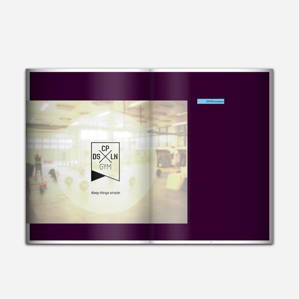
DSCPLN’s tagline is “Keep things simple”. Like oldschool workouts, no training machines, just free weights and functional exercises. And spending your time with other people.
Logo
The logo design was inspired by 3 main ideas: Straight Edge movement and philosophy, simple and strong geometric design, as well as heraldic banners and shields. Rules, strength, tradition and simplicity = discipline.
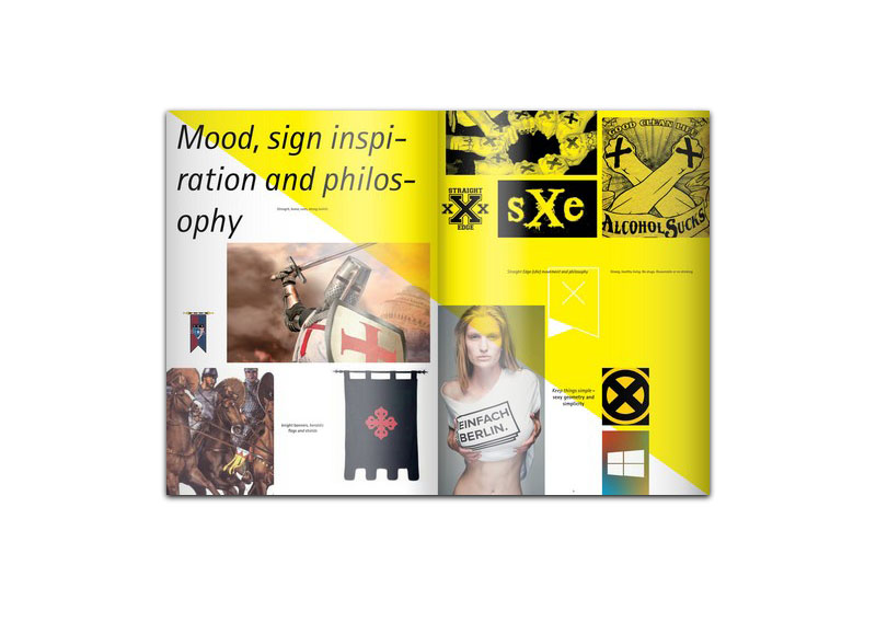
The sign includes also font characters inspired by university sports.
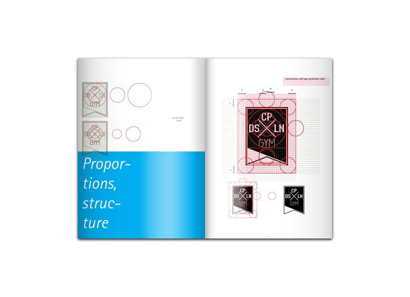
Its design was based on golden ratio proportions. The rhythm created by repeating circular proportions in sizes of elements used, makes the sign closed and whole, with its gravity center exactly in the center of the DSCPLN letters.
Versions
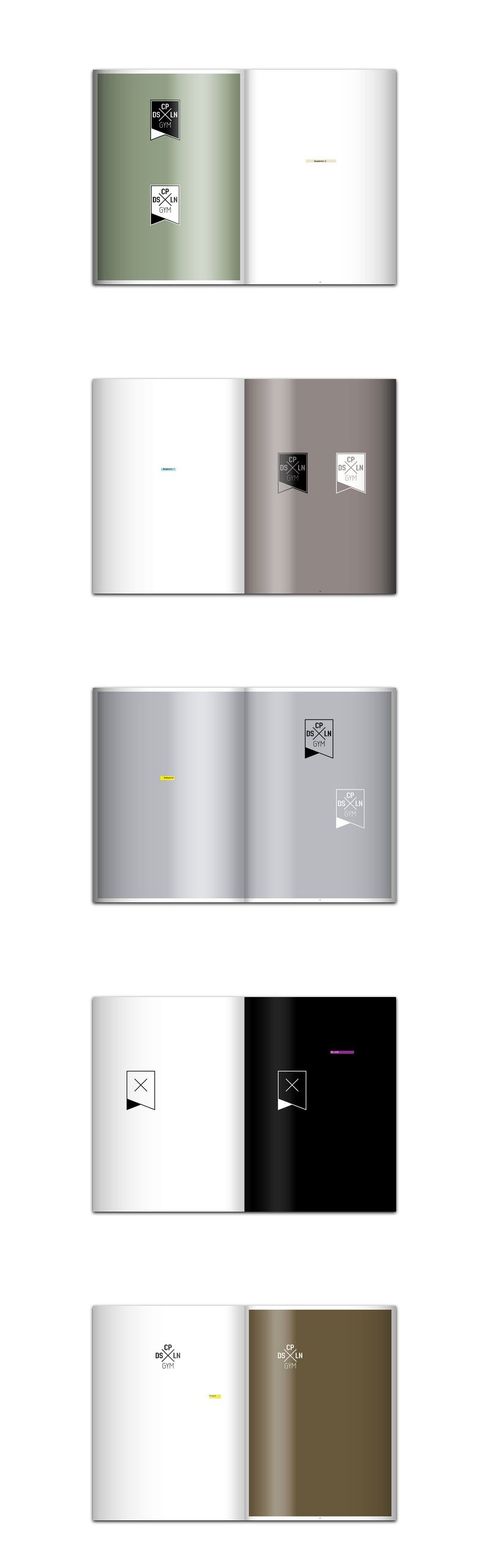
I designed 5 sets of logo versions for different purposes – including ‘No info’ version for guerilla marketing ie. stickers, stencils (see picture).
 It’s alive!
I created visualisations of the sign in different contexts – as badges (pins), wall stickers, lanyard, sports bag and mug, as well as a DSCPLN bottle, shorts, rashguard, tees, and, of course, the DSCPLN Gym car.